
Creatives, Adobe Illustrator, Vector, Illustration
Coming up with ideas and having an efficient work process is key to being a successful creative. There is no time to sit and wait for inspiration, and even when you do have an idea it's often hard to juggle multiple projects at once. I will be giving tips on what to do if you find yourself stuck in the creative process in a series called Stuck Illustrator Rescue Tips.
Stuck Illustrator Rescue Tip 1: Colour
Part one of this series is about colour. Colour is very important in my work and it’s one of those areas in illustrating that clients can be very particular about. It is best to have a flexible attitude to defining colors or you’re in for a difficult project management process.
After a sketch is approved, I move over to Adobe Illustrator to lay out the composition, shapes and colours. It’s a great tool when you need to change colours a lot. There’s no loss of quality in changing colours in Illustrator and the artwork can all be in one layer without losing flexibility in adjustments.
I start by picking a quick colour palette by using the Colour Picker menu. I tend to go for bright, warm, vivid colours, but sometimes subject matter or client brief dictates a palette more in the faded, desaturated and pastel areas. Whatever vibe I am trying going for, I always make sure there is enough contrast between the colours, so that if shapes in different colours touch, the illustration is pleasing to the eye.
After I am done digitizing the sketch entirely in Illustrator, but before I am sending it over to the client for feedback and a last round of finetuning and correction, I am likely to look for alternative colourways to make sure I've got the right palette for the job. I duplicate my artwork so I will be able to go back to previous versions, and spend a couple minutes tweaking the colours. It's also a likely point in which to get stuck. Here's what I do when that happens.
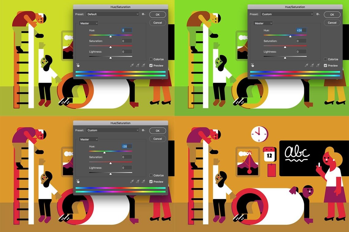
I make a screenshot of a part of the illustration and bring that to Photoshop (If you're working in Photoshop already you can select and copy all layers by hitting command-shift-C and pasting it in a new layer). Here I open the Hue/Saturation option from the Image > Adjustments menu and I will turn the Hue slider up and down. Often, something exciting happens and colours pop up that I wouldn’t have picked in Illustrator. In this case, I don't like what happens when I slide up, but I do like what happens when I bring the Hue slider down. When I am happy with a certain color, I take another screenshot and bring it back to illustrator, where I select the shapes with the same colour using the magic wand tool, replacing it with the new colour with the eyedropper tool. Usually it doesn’t work using all new colours. I often pick only one or two colours from the new screenshot, and then tweak my old colours based on the new colours, keeping the contrast up and the overall image fresh and appealing.
Looking for new and unique colours this way makes me think outside my comfort zone or signature palettes, and this process feels more natural than endlessly sliding CMYK or RGB sliders up and down.
Hope you get something out of this, regardless your style or software. Let me know how you handle colour in your work!
Wijtze Valkema is a commercial illustrator who believes in creating upbeat illustrations in a grey world. Connect with him at wijtze@gmail.com or on Twitter @wjitze